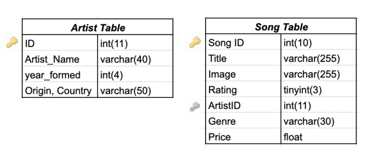
For this website, I have decided to sort and visually present my database using Title, Artist, Genre, and rating.
While furthering what to use for the one to many relationship, the most logical is that many artists will have multiple
songs being used on the website. Therefore I have linked ArtistID from the song table to have a relationship ID from the artist table.
Comments and Feedback
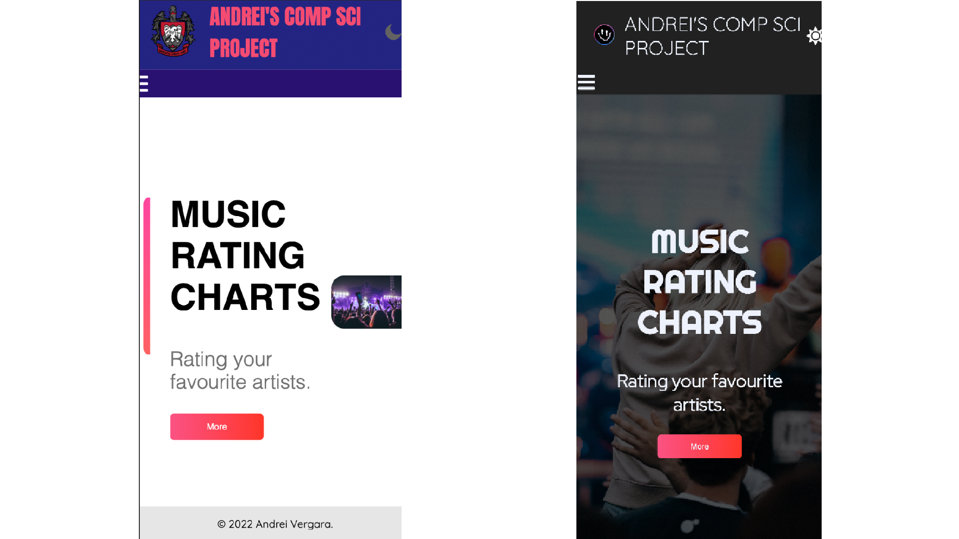
“I like the dark mode but also maybe add a light theme just to give the
option if people are viewing it in bright sources and need to read it, it can still be accessible?”
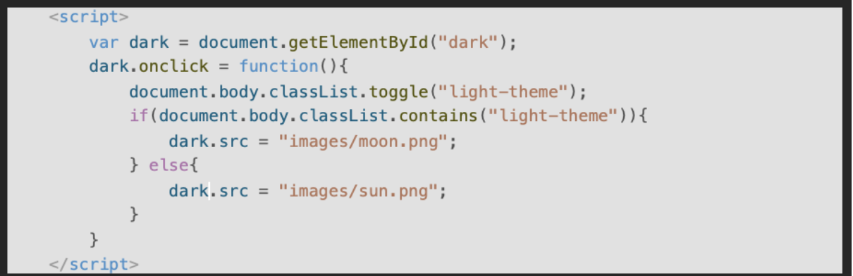
I have decided to use Javascript in order to further simplify the process where normal css would normally be more complicated.
This process is simple and it is by creating classes for the variables that switch between light and dark with the user input.
This however does not save or transfer the data on whether or not the user is on light or dark mode going to new pages.
To revisit and remedy the situation I have decided to base it on two solutions.
Creating a copy of each webpage and having the duplicate be the opposite color theme so that when
the user presses the theme icon it's basically the same webpage just different css.
Creating a system in which pressing the theme button is saved onto the website and is transferred between the webpages.
“The website doesn’t work as well on my phone”
I have noticed and taken this into consideration, Due to multiple clashes with the css, I have put this back into revision.
Before I put too much emphasis on homepage that can overwhelm the user with color and formatting that was meant for desktop
users, I have decided to simplify my website design that not only would reduce the amount of coding needed and remove unnecessary variables.
Website Principals
Simplicity
I have decided that I need to focus on the simplicity on the website, implementing features that serve the purpose of allowing the user
to browse the website comfortably. This is done through Imagery, Colour, and Typograhpy. I have removed unnecessary images and have used
one image to further encapture the website personality, First impressions are crucial in order to engage the viewer so therefore by having
an image that best represents your website, they will more likely stay and browse. Colour, a small but a effective tool that can influence the
readers mood. Colour has been limited to 3 primary colours, Primarily red, with blue as a secondary color and purple as a inbetween. Typography,
using fonts that are easy to read on both mobile and computer.
Navigation
Straight to the point navigation with mobile navigation included when screen size is smaller than a certain amount to allow the nav bar to not
block the mobile user's view.
Mobile friendly
Mobile support has been added, This includes the css supporting different sized screens in order to reach a wider based audience. Most people are
on the go and being on mobile is crucial for the website. Basic support such as navigation has be modified as well.
Load Time
Most users expect their website to load within a time frame of 2 seconds, failure to do so can often make users uninterested in using the website